本文由OPEN編輯部撰寫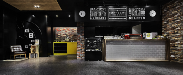
設計概念Design Concept
基地位置鄰近大龍峒及大稻埕,早先為各國洋行集散地,由此背景發想,十硯設計 陳逸群 設計總監、鍾馥如 總監 將腦中浮現的畫面——碼頭景象:工人忙碌地往來搬運、貨倉上下船艙與來去的英美人士——轉換為現實場景,引渡英美風格進入設計場域,再現早期風光的同時,也將年輕氣息帶入,形塑出活潑中帶古雅的氣質調性。
The base of the project is near Da Long Dong and Da Dao Cheng precinct, which is used to be the foreign trade distribution center. Take the notion of the background, LNF Design Firm Creative Director Lawrence Chen and Director Fran Jong tried to plan the layout of wharf feature: the busy transportation workers, the cargo loading in and out of the warehouses, and the British and American businesspeople - take advantages of the Britain-American style, perfectly bring about the heyday scenes, furthermore, put some striking young elements into the space, hence creates a vivid and cultured tone.
設計手法Design Techniques
現代手法再現古典風範
Modern craftsmanship manifests the classical spirit
櫃檯和餐具區鮮明的白、黃櫃體,分別象徵碼頭貨倉運輸和貨櫃樣貌,帶點美式和英倫雅痞風;混色文化石拼貼牆面,豐富磚牆意象,同步老建築與工業風格的呈現。團隊融鑄富含歷史感的街弄氛圍於休憩處所,向黃金時代的繁華致敬,選取黑、灰、棕三種色系調和,益增空間暖度。
The bright white counter and the yellow tableware cabinet symbolize the appearance of the wharf containers, which with a touch of American and British Yuppie style; make use of the mixed color cultured stones of the wall finish to create the feature of the brick wall, and at the same time present the factors of a vintage building and the Loft style. We tempt to create a rich street atmosphere of this unwind place, pays homage to the prosperity of the golden age; and by way of the black, grey, and brown color scheme to increase the warmth of the space.
奇思漫想實現空間想像
Ingenious ideas implement the spatial imagination
意象的化用在本案各細節中扮演重要角色,諸如隱含彩虹及暖和寓意的大時鐘浮雕、轉換自碼頭模樣,將木棧道由地面拉至頭頂展現的天花板,皆忠實呈現對「漫」與「慢」的定位,並詮釋出設計構想之於實際施行上的影響,予人一潛心休憩的場所,展開設計者與入內者互動的漫天奇想。
We valued the details of the image application of the project, such as the large clock relief that casts the shape of the rainbow; and we also transformed the original wooden walkway on the floor to the ceiling pattern. All above that manifest the characters of "handing out" and "ease up". Furthermore, to interpret the impact of the design concept onto the solid construction, as well to provide a soothe domain for the designer and the guests of whimsical interaction.
多重元素點亮單一場域
Multiple elements highlight the focal area
從基地位置著手發想,在豐沛的古早精神裡注入年輕元素,設計團隊於英美風格中結合工業風,並暗藏設計亮點,加以鮮明色的飾櫃,使空間中充滿明快氣息。大片的仿水泥PVC地磚,以中性灰色調注入輕鬆調性;深色木材作為搭配鐵鏽磁磚配以墨鏡,於空間色度上給人與眾不同的感受。聚合因子顯出畫面的同時,以多重意涵存在的物件使人一眼望去,處處充滿驚喜。
In view of the location of the base, we add young elements with the vintage spirit, and merge the Britain-American style with the Loft style, moreover set up the function cabinet of bright hue, so that brings about the striking points of the vivid atmosphere. The neutral grey PVC tiles of imitate cement texture bring out the relaxing tone; on the other hand, the timbers of deep tinge work in concert with rusted tiles and a dark mirror that gives people stunning vision. By means of the combined factors, hence creates the charm touching everywhere.
入口
The entryway
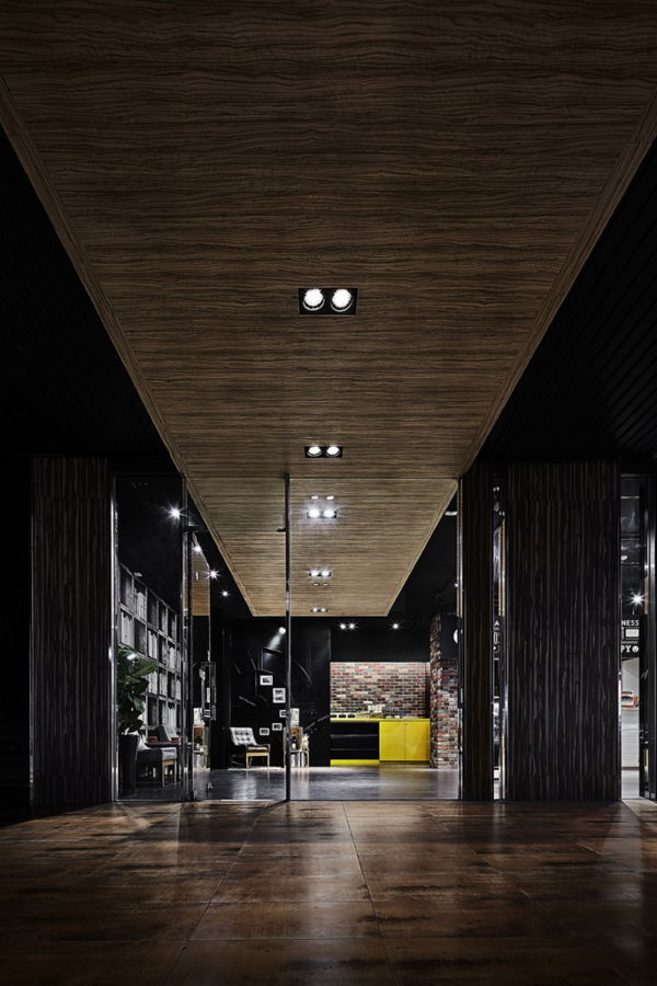
自內而外延伸的天花板,形塑出反面趣味的紅毯氛圍,
左右樑柱以深色木質地襯托中央主角——由碼頭概念發想而成的天空棧道,
店內的天花板不加修飾,挑高空間感的同時,也使棧道成為視覺焦點。
The ceiling extending from the indoor to the outdoor that forms an interesting feature seems like the red carpet. The dark wood columns on the left and right sides set off the interior rustic ceiling that constructs from the concept of the wooden walkway, which not only creates the spacious vision, moreover makes it become the eye catch element.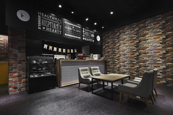
餐區
The dining area
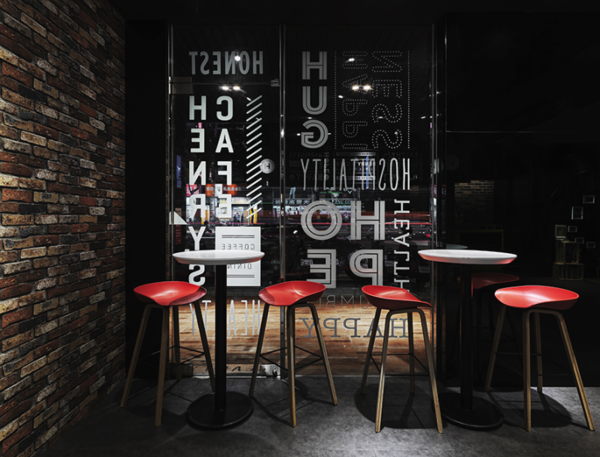
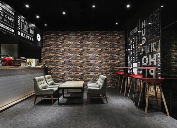
櫃檯區和餐區分別安放皮沙發和塑質高腳椅,
兩樣氣質相反的物件,因材質反差而生成活潑質感。
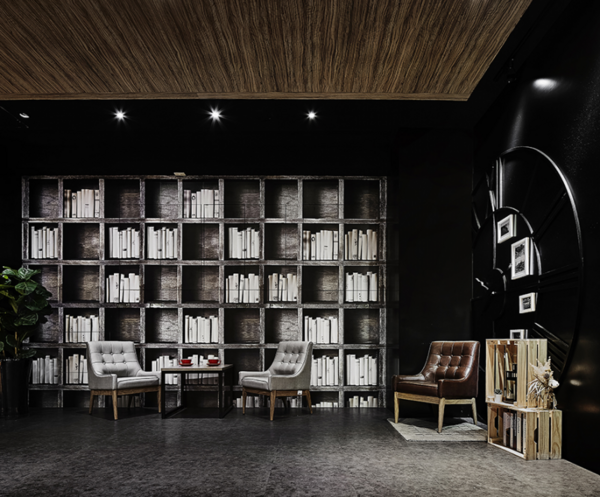
灰白色為基底的貼面書牆,在創造人文氣氛的同時,
隱藏收納櫃和電箱,是設計的另一巧思。
藉著不同的視覺導引,設計團隊將餐飲空間
化身為古老風華的記憶者,
以煥然一新的姿態迎接來往的過客。
Place the leather chairs and plastic barstools in the dining area. The contrast materials of distinct texture generate the impressive vivid tone.
The off-white built-in bookshelf, besides creating the feature wall of humanistic ambience, as well to conceal the circuit case and possess the function of storage, which is an appreciable ingenuity of design. By way of the varied captivating visual guidance, we successfully transform the vintage building to a brand-new layout, and then initiate an inviting space for our guests.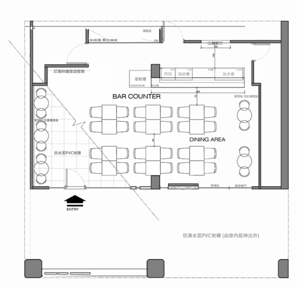
▲平面圖
項目資訊
案名:漫想・慢享
項目類型:商業空間
項目地址:台灣台北
設計團隊:十硯設計
項目坪數:40坪
主要建材:文化石、進口壁紙、楓木深刻木皮、進口PVC地磚、烤漆玻璃、鐵件
OPEN Design 動能開啟傳媒:http://www.openworld.tv/talk/




留言評論